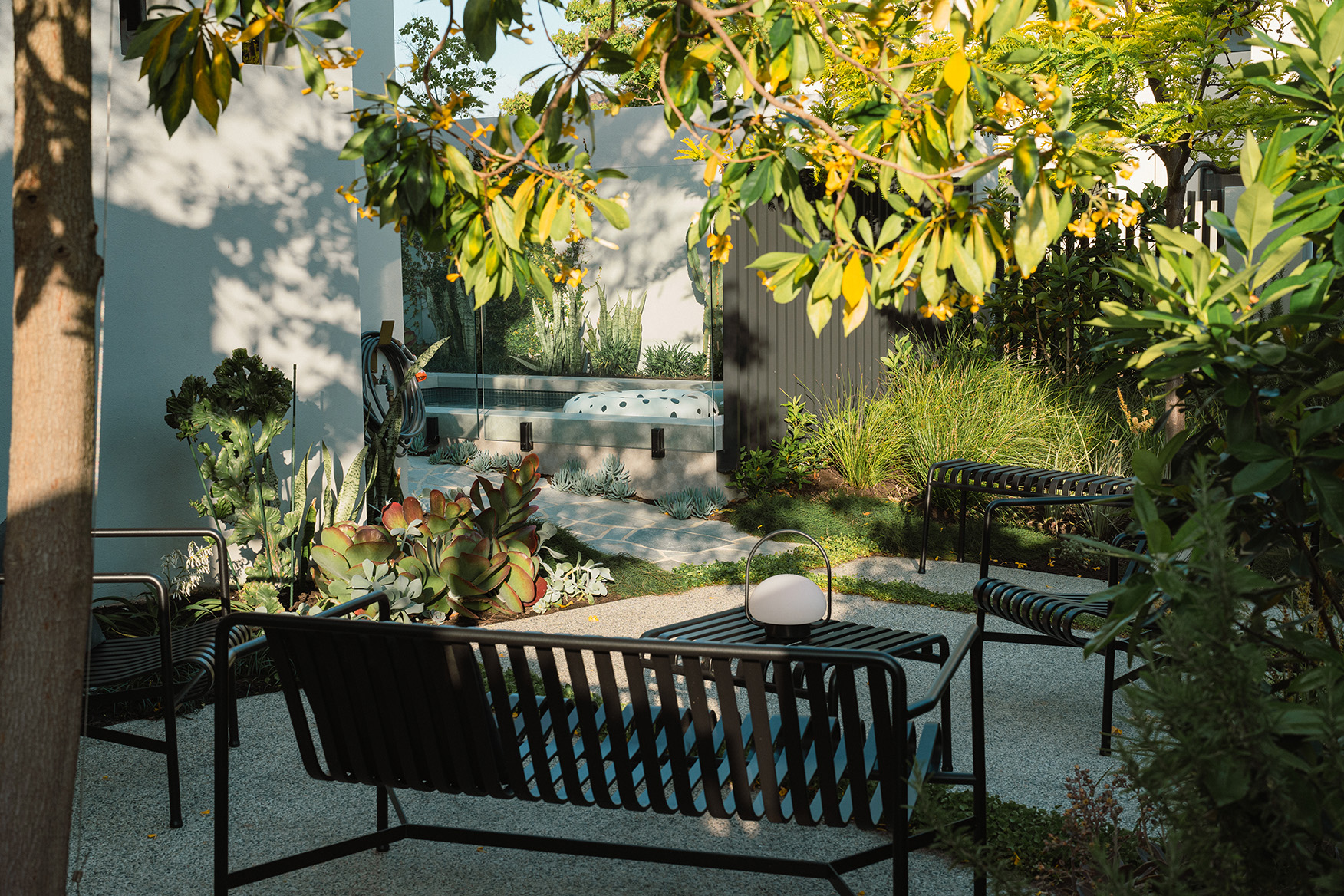
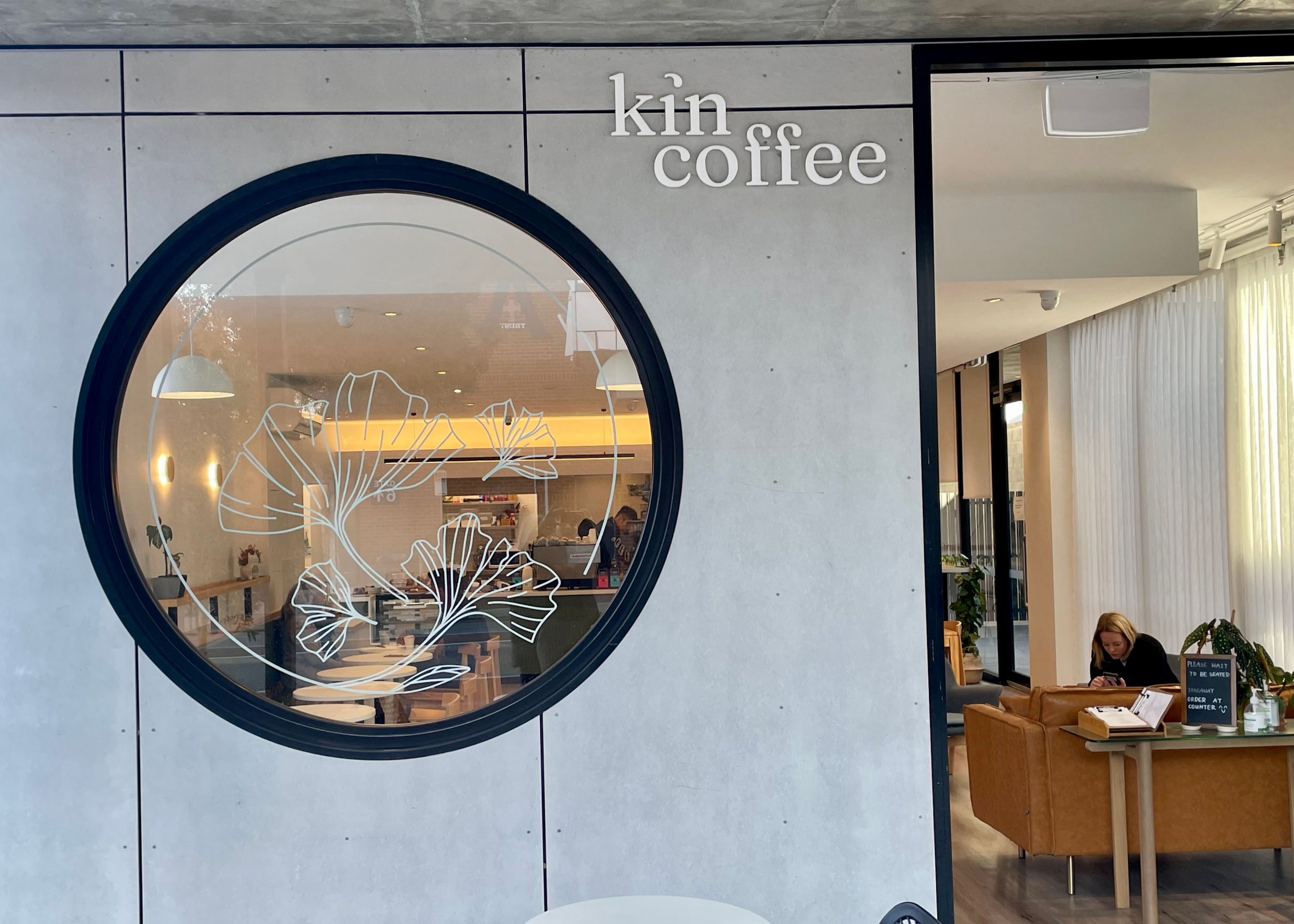
Graphic design dictionary.
Welcome to part 2 of Lessons on Lingo, a blog series that aims to shed light on different terminology you hear thrown around in graphic design meetings. This time we are delving into the realm of images and graphics.
Have you ever had a discussion about your company’s marketing collateral and not found the words to describe how you would like a website spaced? Or perhaps a graphic designer has suggested using a flat image and you’ve thought, “What? Aren’t they all flat?” Well, consider that clueless convo your last and read on to get full bottle on all things graphic.
Texture
Though an image is either digital or printed onto a surface, and when we touch it all we can feel is the screen or piece of paper, images still have texture. Visual texture describes the association a person makes with a real object when viewing an image. A non-textured background can look quite plain and uninteresting, whereas a background that is made up of images of wooden panels or cloth can add warmth and character to a graphic.
Scale
Scale refers to the size of an object in relation to another one. When planning a design, it is important to consider how scale can influence the tone or meaning of the design. It can also establish a visual hierarchy.
The term scale can also be used to reference changing the size of an object. When you scale an image down it is to make it smaller and scaling an image up means making it bigger.
Aspect ratio
Aspect ratio describes the proportional relationship between the width and height of an object and is presented using two numbers separated by a colon. You would have used aspect ratios when determining how big a television or computer screen is.
Knolling
Knolling is the process of arranging a collection of objects parallel to each other (at 90° angles) on a solid background and photographing them from above. This is an effective and visually appealing way to present a range of products.
White space
The areas that are intentionally left blank on a page are referred to as white space. White space is used to create balance and to draw the viewer’s eye to an image or a block of text without distraction.
Flat
A flat image is a design style that is a simple, minimalistic 2D image. It features crisp lines, open space and bright colours and looks friendly and approachable.
Raster vs vector images
Raster is an image format made up of a grid of pixels and can appear blurry when scaled up in size. A vector image format is made up of points, lines and curves that can be re-sized without distorting or losing quality.
Resolution
Resolution refers to the quality of an image and therefore how clear and crisp it looks. An image’s resolution is based on how many pixels per inch it has. The more pixels, the higher the resolution and the better the quality. High res images are a larger file size than low res ones.
We will be delving into terminology related to colour and typography in future Lessons in Lingo. Stay tuned!
Graphic design dictionary
Read our first Lesson on Lingo about Brands and Logos here.